
Shades and Textures to Target for your Next Office Fit Out
One of the big buzzwords in office fit out these days is ‘resimercial’. A hybrid of two separate and common words you’ll no doubt have heard of before – residential and commercial – it’s a way of describing the new look and feel of commercial design, and offices in particular.
Introducing a home from home/office feel
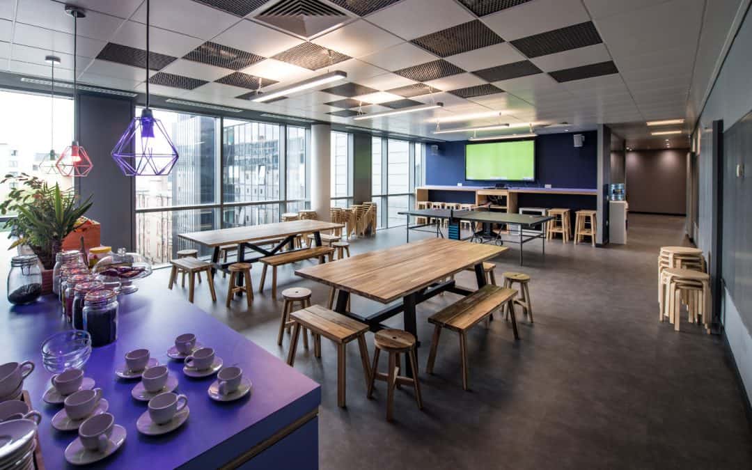
What it means is that increasingly the upcoming Generation Z is looking for a more homely and comfortable, laid-back environment in which to foster their creativity and become more productive. In other words the office is going to look more like home, with break-out areas furnished with comfy sofas, a low coffee table and the ubiquitous coffee machine where workers can go to relax and refocus between bursts of inspiration and innovation. At least that’s the plan.
One way to achieve a more relaxed and homely environment is to introduce varying textures – both basic and luxurious – together with shades of colour designed to promote particular moods.
Mixed materials for Millennials and Generation Z
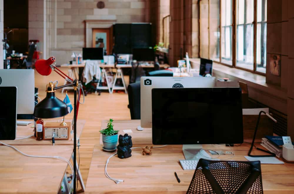
For quite a few years office fit out design has focused on introducing more natural materials into the previously ‘plastic’ office environment. Concrete in the form of flooring and a surface for the reception or board room desk, wood for wall partitions and stone as an art form have all been incorporated into the young and forward-thinking insurance, finance, IT, Market Research and PR companies out there. Add some colourful woven rugs, a sheepskin cushion, velvet chair cover, slouchy beanbag, woven basket and maybe even have the odd yoga mat dotted around and you’re well on the way to pleasing a younger generation of office workers.
Biophilic design is still huge
Then there is the texture provided by plants and the outdoors. Water features in reception areas and even vertical living walls in offices (where an entire wall consists of growing greenery) have been making their presence felt in office fit out areas everywhere – but specially in city centres where access to the outdoors is more limited.
Natural textiles are big news too, as are patterns and fabrics which reflect nature, such as cotton and silk cushions showing today’s tropical leaf designs or bamboo coffee cups with retro prints and refurbished desks.
And why not? It’s good for staff well-being, health and even happiness say those in the know. This is especially true when you consider it’s not just about the plants taking all the negative ions out of the atmosphere. No, plenty of other aspects of office design come under the biophilic banner too; being ‘green’ also means using renewable energy sources, recycling everything possible and even sourcing local snacks and drinks for the office kitchen. We’re already doing walking meetings, but how about an office greenhouse? It could happen…
In the meantime, lighting – like colour – is known to have a big impact on our moods. Natural daylight is seen as being better for us and if we can’t have that then LED lighting using either warm or cool white bulbs.
The part played by colour
Those break-out zones we spoke about earlier with the comfy sofas and low coffee tables will, of course, be carefully matched with the appropriate colour shades. And that means relaxing neutral tones, such as an oatmeal sofa and beige coffee table, but with a bright burst of a ‘fun’ accent colour such as lime green, bright orange or racy red colours. All of these colours, according to psychologists are known for their ability to ‘inspire’ and ‘motivate.’
Certainly colour psychologists insist different colours can alter our moods, feelings and emotions. Even the great artist Pablo Picasso – known for his dramatic use of colour and cubist style – was heard to remark that: “Colours, like features, follow the changes of the emotions.”
Different areas of the spectrum evoke different emotions
Colours in what is the ‘red area’ of the colour spectrum i.e. red, orange and yellow, are described as ‘warm.’ Psychologists claim they are capable of evoking feelings of warmth and comfort but also hostility and aggression. Those colours on what is known as the ‘blue area’ of the spectrum are commonly referred to as ‘cool’ colours i.e. blue, purple and green. Their positive attributes is to evoke a feeling of calmness. However they can also lead to indifference or even sadness.
In fact, so strong is the belief in colour’s ability to affect our bodies that some alternative therapists use it for healing. A practice referred to as chromotherapy (or light therapy) and popular in China in particular, these individuals believe that red can stimulate the body/mind so is good for circulation; orange is used to increase energy and blue is seen as a colour which can soothe psychological and physical illness.
So you can see why it is so important for office fit out designs to really think through the colour implications on every individual project – especially if certain colours can affect workplace productivity (red end of the spectrum) and others improve health and safety (blue end of the colour spectrum). Another point to ponder is that the effects of colour is believed to be temporary (i.e. only when an individual is exposed to the colour in question).
Colours and the restaurant trade
Ever wondered why fast food restaurants tend to have tables, chairs and signage in bright colours, such as neon orange, red and yellow? The reason is that these colours, with their lively and stimulating inferences, are designed to make diners feel restless and ready to move on quickly. Upmarket eateries, on the other hand, emphasise relaxing and seductive shades such as blue and deep burgundy or black. The intention is to make diners stay longer and spend more.
Lighting very much comes in to the lighting trading too. Soft focus lighting is more flattering and will make a diner feel more confident while fast food restaurants will usually always opt for bright lighting to encourage that ‘must get on’ feeling in diners.
Pantone and their colour palettes
Pantone is viewed in America and Europe as the company which sets the colour trends for the following year. The shades they chose are then incorporated into both the worlds of fashion and interior/commercial design.
This year the US-based colour gurus launched eight trend palettes. The Resourceful palette is based around shades of blue and orange (traditional opposites on the colour chart) and which would be perfect for a lively, bold and disruptive start-up company. More long-established brands on the other hand may prefer the sophistication and dignity of Pantone’s Intricacy palette which is based on neutrals and doesn’t draw attention to itself in the same way as the former.
Steampunk and our office fit out ethos
At Steampunk we’d be delighted to come and chat over some creative ideas with you and your team. Why not take a look at projects we have already finished already and which you will find showcased on our website at www.Steampunkfitout.co.uk. If you’d like additional info or to request a one-to-one chat then do give the team a call on 0800 197 2922. We’d love to hear from you!